Brand System
HeyFin v5
Brand Guidelines
Royal Blue Warm Discovery — Trust meets warmth
v5.0 — April 202601 · Philosophy
Trust Meets Warmth
v5 distills what worked across four previous iterations into a single, confident system.
Version Comparison
| Trait | v1 — Corporate | v4 — Warm Discovery | v5 — Royal Blue |
|---|---|---|---|
| Accent | #1A1A1A (Black) | #FF7A65 (Coral) | #2563EB (Royal Blue) |
| Tone | Formal, corporate | Playful, casual | Warm-professional |
| Radius | 4px sharp | 12-24px rounded | 8-24px balanced |
| Buttons | Square, dark | Pill, coral | Pill, blue |
| Animation | None | Spring bouncy | Ease-out subtle |
02 · Colors
Royal Blue + Warm Neutrals
A 10-shade blue ramp for flexibility, warm neutrals for the canvas, pastels for feature highlights, and semantic colors for feedback.
Royal Blue Ramp
Warm Neutrals
Pastels
Semantic
03 · Typography
Plus Jakarta Sans + JetBrains Mono
Geometric-yet-rounded letterforms. Warm professionalism with excellent legibility at every scale.
German Compound Word Test
Longest common compound word — verifies Plus Jakarta Sans handles extended German strings without awkward letter-spacing or kerning breaks.
04 · Components
Warm, Round, Confident
Pill buttons, rounded cards, pastel feature surfaces, and clear input states. Every component reinforces trust and approachability.
Buttons
Primary
Secondary
Ghost & Destructive
Inputs
Bitte eine gültige PLZ eingeben.
Cards
Default Card
Steuerberater / WP
München · Sofort verfügbar · ab 65.000 €
Hover State (hover me)
Bilanzbuchhalter/in
Berlin · Ab Mai · ab 55.000 €
Pastel USP Cards
KI-Suche
Beschreib in eigenen Worten, wen du brauchst.
Karte
Fachkräfte auf der Karte entdecken.
Verifiziert
Jedes Profil wird geprüft.
Sofort
Ergebnisse in Sekunden.
Badges
Trust Badges
Testimonial Card
FAQ Item
05 · Logo
HeyFin Wordmark
The wordmark uses Plus Jakarta Sans 700. The dot on the “i” is always Royal Blue on light backgrounds and white on dark backgrounds.
Usage Rules
Minimum size: 80px wide for digital, 20mm for print. Below these thresholds the dot on the “i” becomes illegible.
Clear space: Maintain a clear zone equal to the cap-height of the “H” on all four sides. No other elements may intrude into this zone.
Background Rules
| Background | Text Color | Dot Color |
|---|---|---|
| #FFFFFF / light | #1A1A1A | #2563EB |
| #1A1A1A / dark | #FFFFFF | #2563EB |
| #2563EB / blue | #FFFFFF | #FFFFFF |
Generated Logo Concepts
13 active concepts with Gemini-generated variations. A-C from v1 (updated for Royal Blue). G-P are new v2 concepts focused on clean typography and minimal geometric accents. D-F retired (too complex).
Concept A: “The Wordmark”
Pure typographic wordmark. “HeyFin” in Plus Jakarta Sans Bold with Royal Blue dot on the “i”. Like Uber, Spotify, Airbnb.
Concept B: “The Signal”
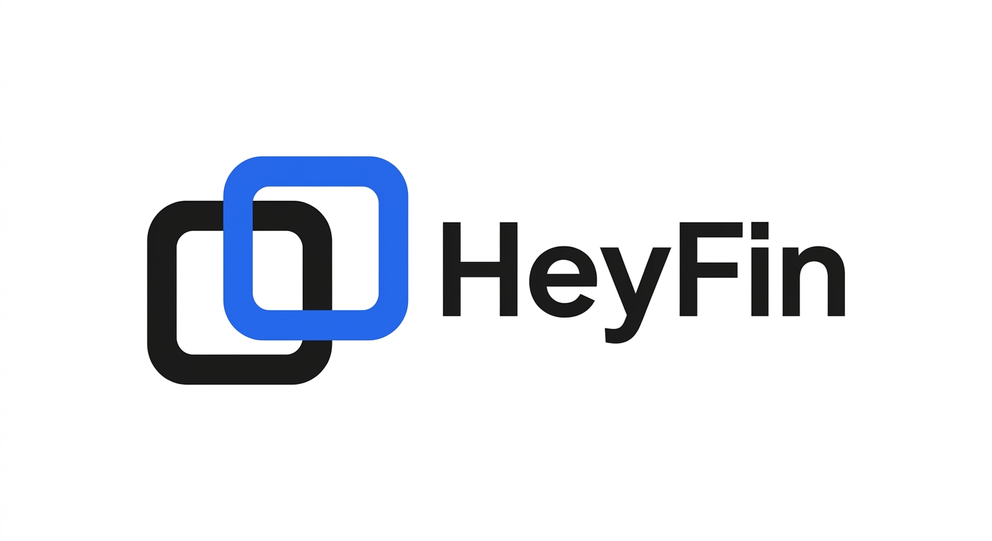
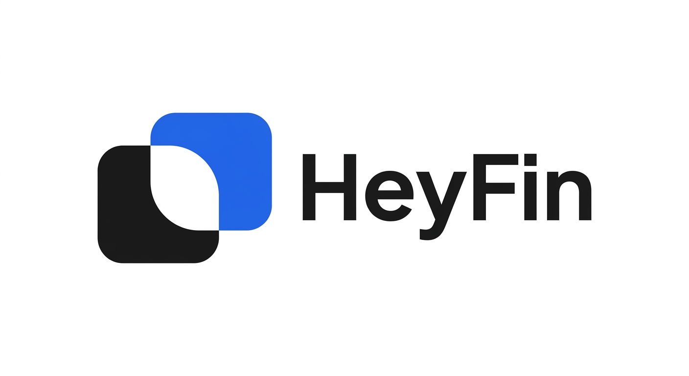
Two overlapping rounded squares creating a lens/window shape. Black + Royal Blue. Symbolizes matching — two parties connecting.
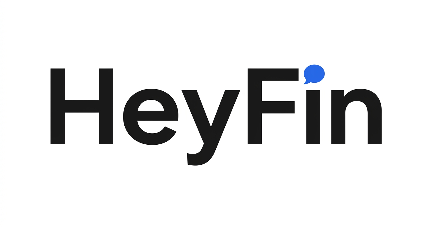
Concept C: “The Chat Bubble”
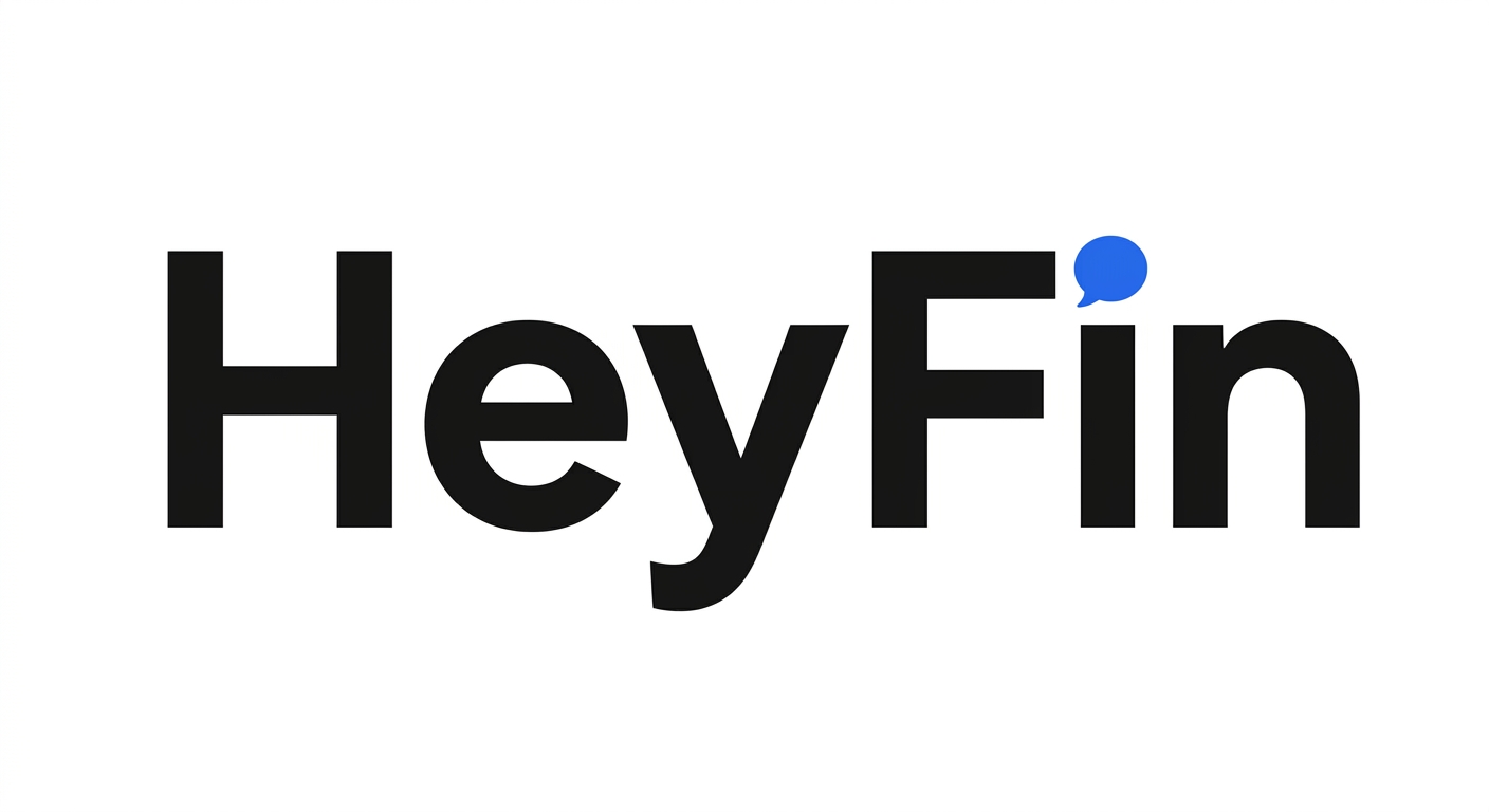
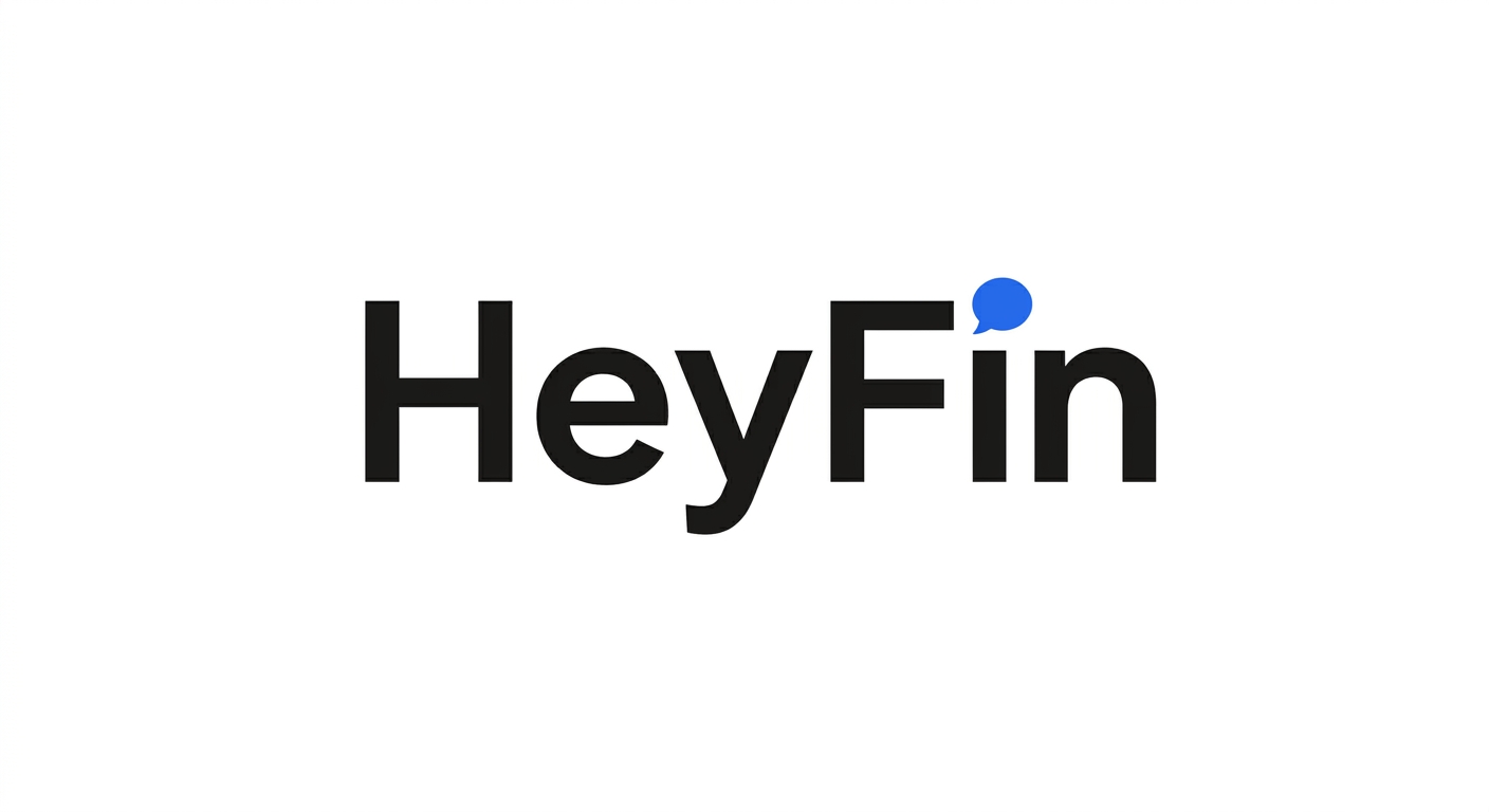
Wordmark with the “i” dot replaced by a speech bubble in Royal Blue. References AI chat — a delightful discovery at larger sizes.
v2 Concepts — Clean & Minimal
10 new concepts focused on typographic elegance and minimal geometric accents. 2 Gemini variations each.
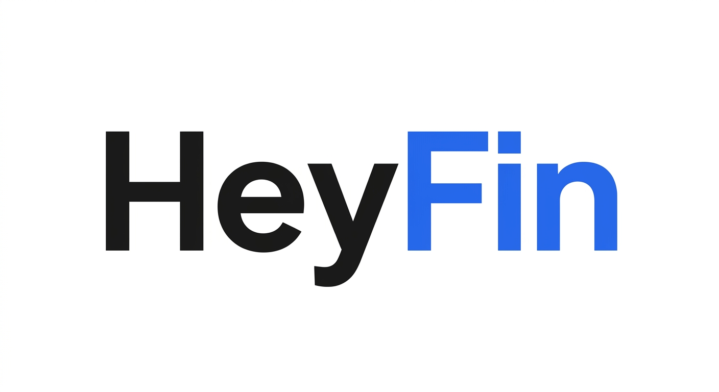
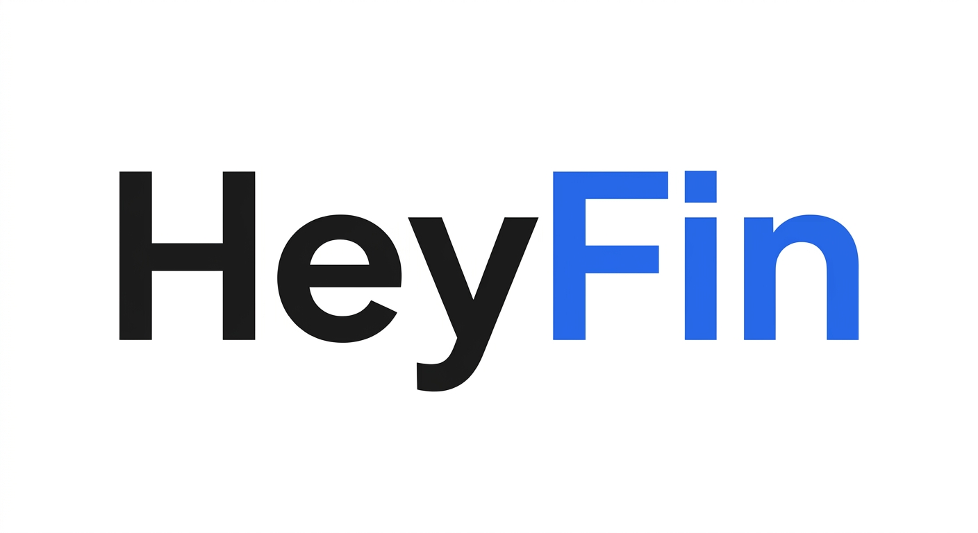
Concept G: “The Color Split” v2
“Hey” black + “Fin” Royal Blue. No symbol, no icon — pure typographic color split. The color transition IS the brand mark.
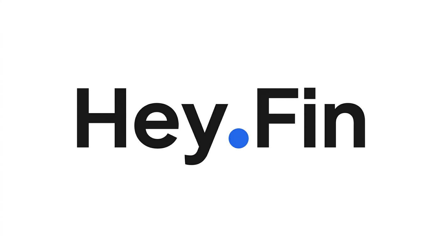
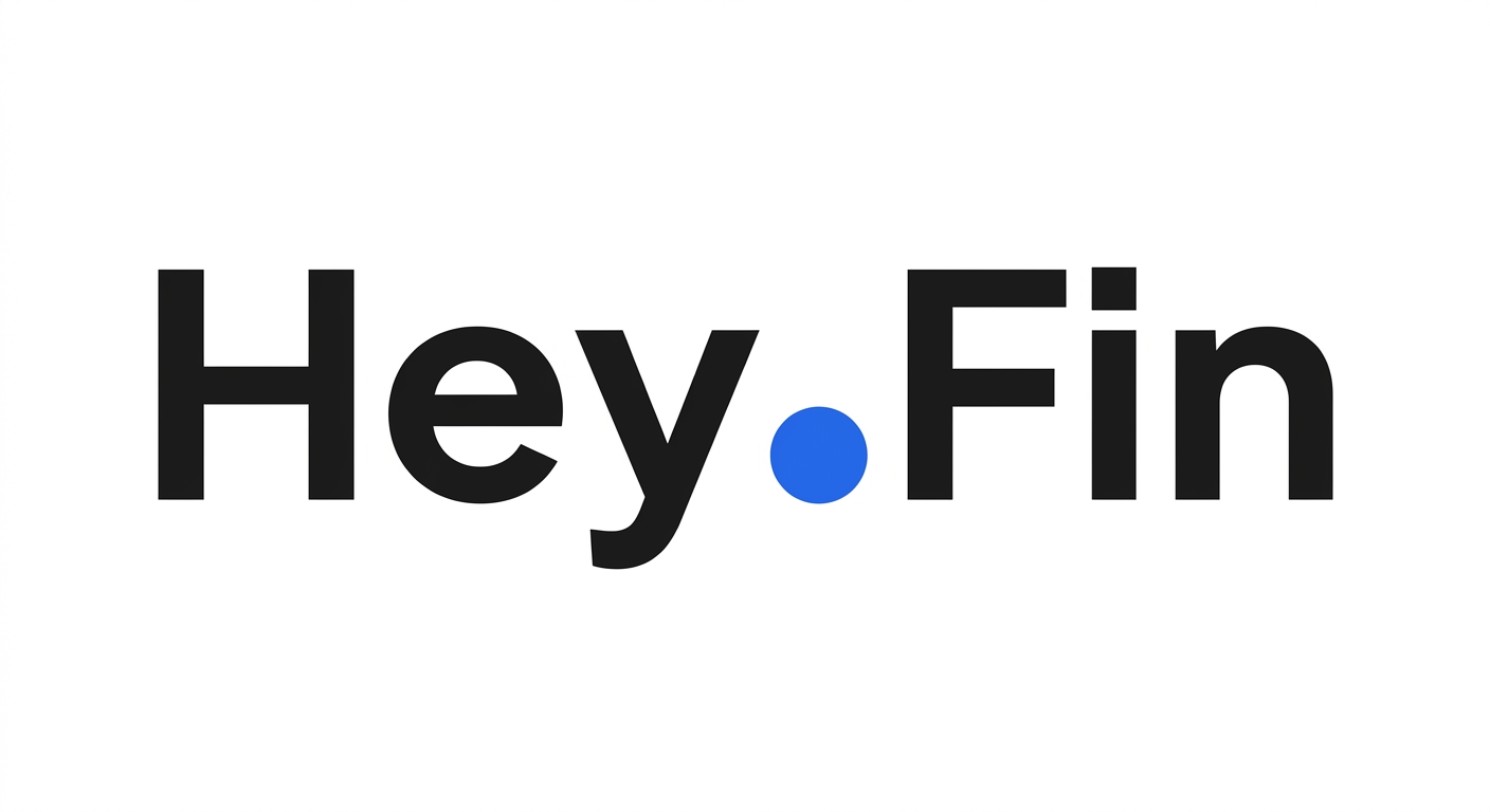
Concept H: “The Big Dot” v2
“Hey.Fin” with an oversized Royal Blue dot as period/separator between the two words. The dot is the brand accent.
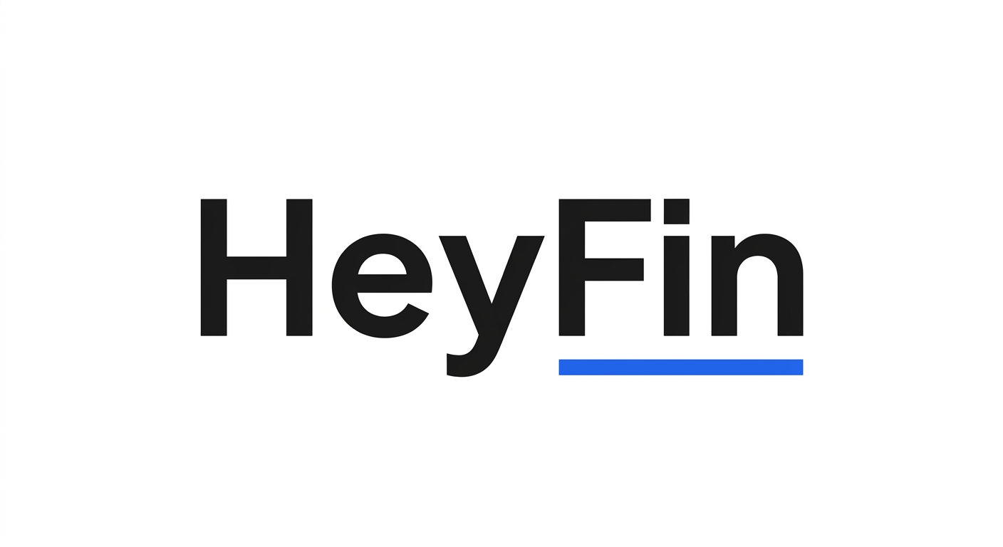
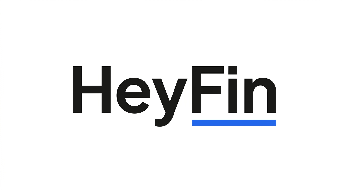
Concept I: “The Underline” v2
Royal Blue underline beneath “Fin” only. Highlights the finance domain while keeping the greeting casual. Editorial, sophisticated.
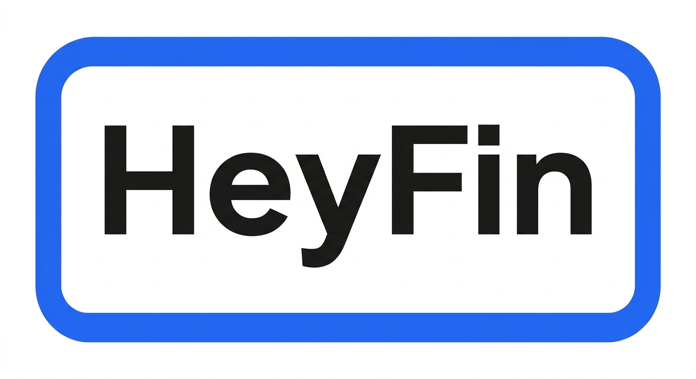
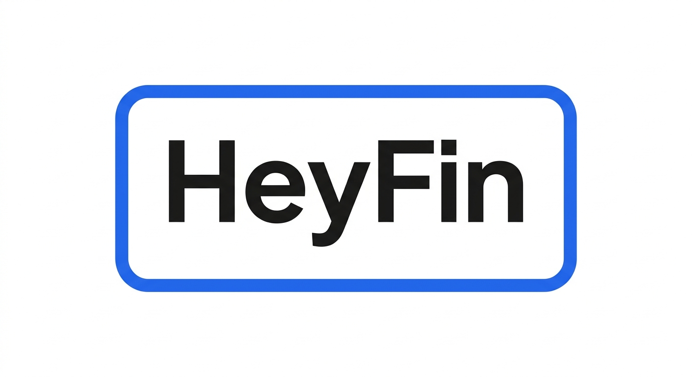
Concept J: “The Frame” v2
Wordmark enclosed in a simple Royal Blue rounded rectangle outline. Badge-style containment. Instant app-icon readability.
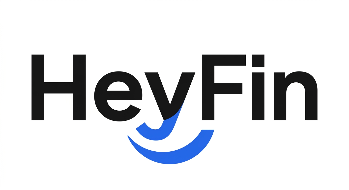
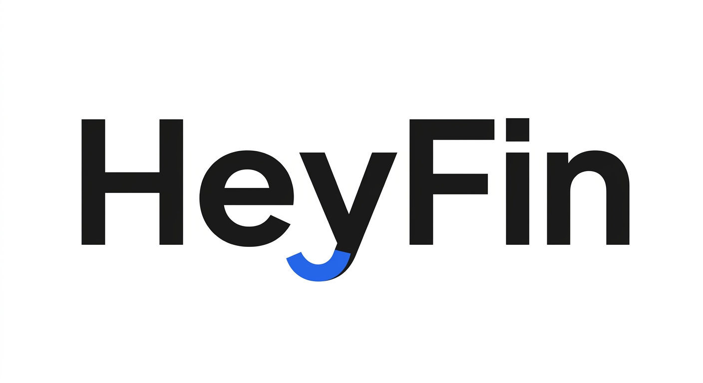
Concept K: “The Smile Tail” v2
The lowercase “y” descender curves up as a subtle Royal Blue smile/checkmark. Minimal typographic customization.
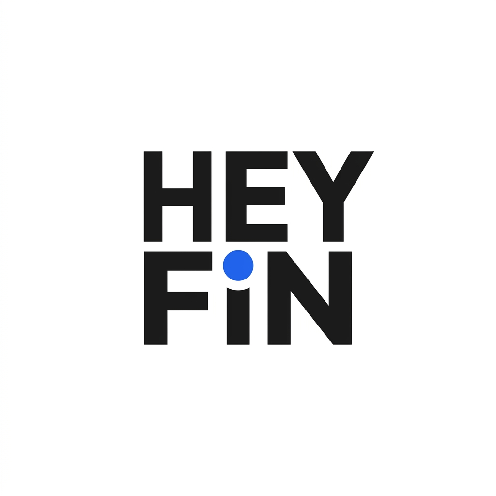
Concept L: “The Stack” v2
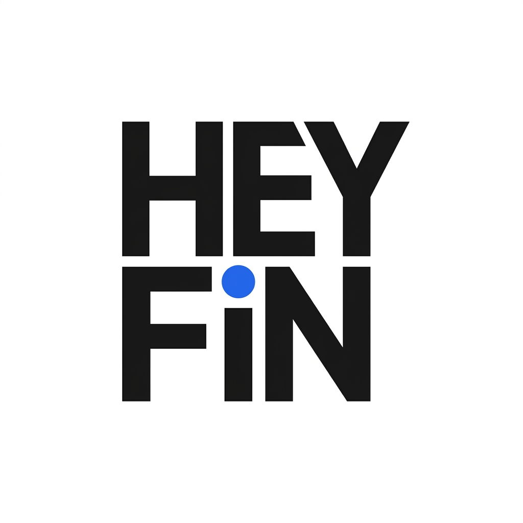
“HEY” / “FIN” stacked, uppercase, compact square proportion. Blue dot on the “I”. Strong app-icon mark.
Concept M: “The Diamond Dot” v2
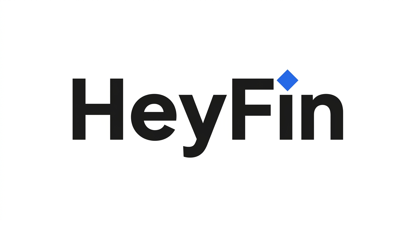
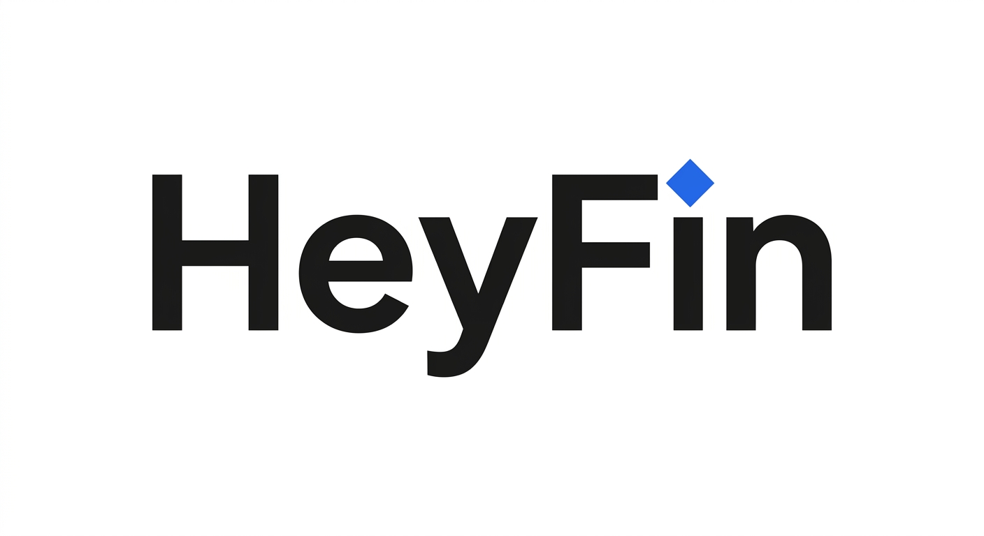
Royal Blue square rotated 45° to form a diamond replacing the “i” dot. Geometric precision, distinctive but clean.
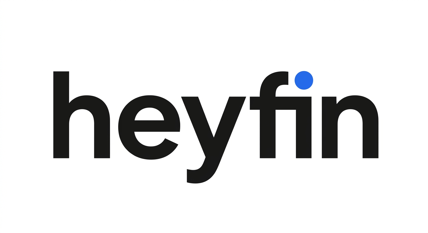
Concept N: “The Lowercase” v2
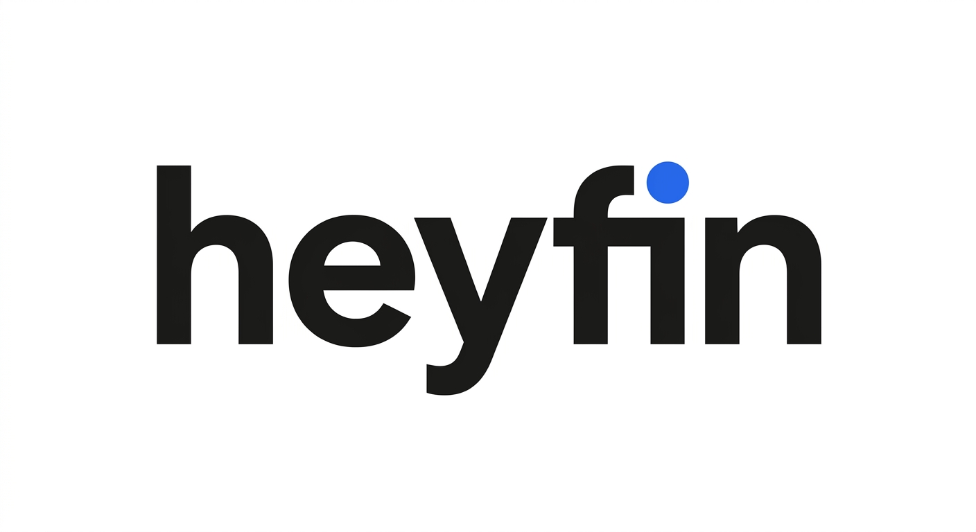
All-lowercase “heyfin” with Royal Blue “i” dot. Ultra-casual, tech-forward, URL/username aesthetic.
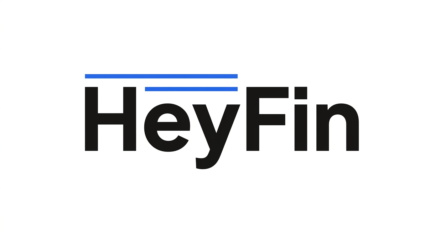
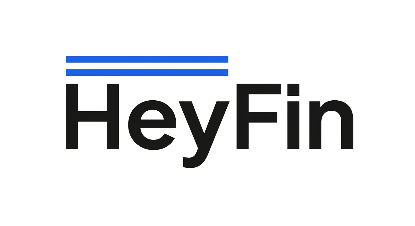
Concept O: “The Crown Lines” v2
Two thin Royal Blue parallel lines above the wordmark spanning “Hey”. A quiet typographic flourish adding distinction.
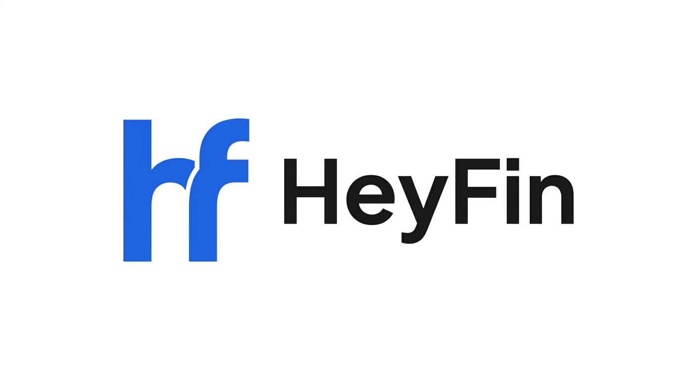
Concept P: “The Ligature Monogram” v2
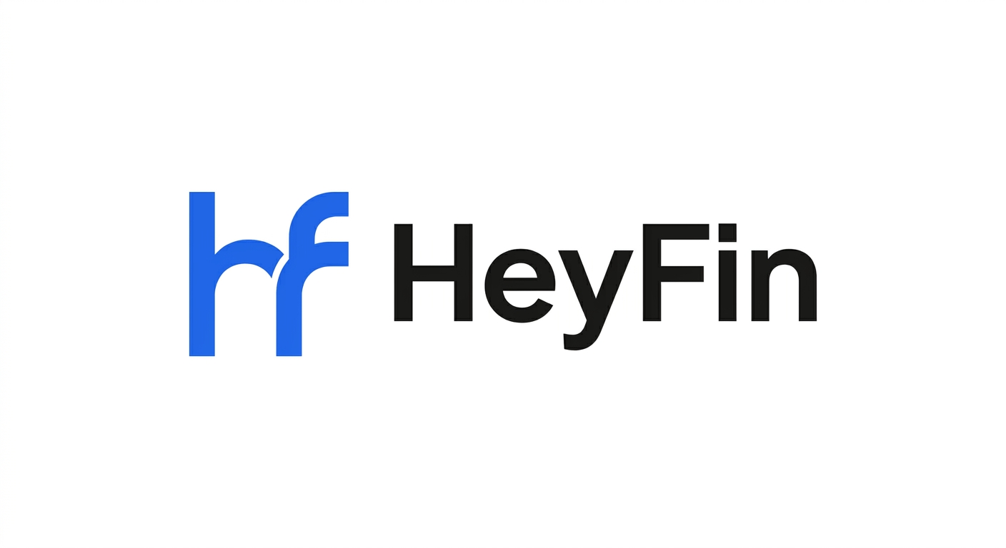
Connected “hf” monogram in Royal Blue — shared vertical stroke. Works at 16px favicon size. Paired with full wordmark.
Retired: Concepts D (Map Pin), E (Handshake Bridge), F (Spotlight) — too complex/messy for the brand direction. Images preserved in assets/logo/concept_d/, concept_e/, concept_f/.
06 · Voice & Tone
Warm-Professional German
v5 uses “du” (informal address) consistently. The tone is confident, clear, and human — never corporate or stiff.
v1 Formal vs. v5 Warm
| Context | v1 (formal) | v5 (warm) |
|---|---|---|
| CTA | Jetzt Fachkräfte finden | Zeig mir passende Kandidaten |
| Onboarding | Willkommen bei HeyFin. Bitte erstellen Sie ein Konto. | Hey! Lass uns dein Team verstärken. |
| Empty State | Keine Ergebnisse für Ihre Suche. | Noch keine Treffer — versuch’s mit anderen Begriffen. |
| Error | Ein Fehler ist aufgetreten. | Das hat leider nicht geklappt. Versuch’s nochmal. |
| Success | Ihr Profil wurde gespeichert. | Gespeichert! Dein Profil ist jetzt live. |
“du” vs. “Sie”
We use “du”
HeyFin targets SMB owners, Kanzlei managers, and HR leads aged 28-50. “Du” signals equality and approachability — the same register used by platforms like Xing Jobs, Personio, and Instaffo. It removes hierarchy and makes the first interaction feel collaborative, not transactional.
We avoid “Sie”
Exception: formal legal documents (AGB, Datenschutz, Impressum) may still use “Sie” per German legal convention. All product UI, marketing, email, and support always use “du”.
Banned Words
These words are too corporate, vague, or overused. Avoid them in all HeyFin copy.
07 · Spacing & Layout
Spacing, Radius & Shadows
A 4px base unit grid. Consistent spacing creates visual rhythm and professional composure.
Spacing Scale
Border Radius
--radius-sm
--radius-md
--radius-lg
--radius-xl
--radius-full
Elevation / Shadows
Container Breakpoints
| Breakpoint | Width | Columns | Gutter | Container |
|---|---|---|---|---|
| xs | < 640px | 4 | 16px | 100% |
| sm | 640px | 8 | 16px | 640px |
| md | 768px | 12 | 24px | 768px |
| lg | 1024px | 12 | 24px | 1024px |
| xl | 1280px | 12 | 32px | 1200px |